When I put the mouse over the point that was 2 years back on the chart it shows the current year.
When I put the mouse over the point that was 2 years back on the chart it shows the current year.

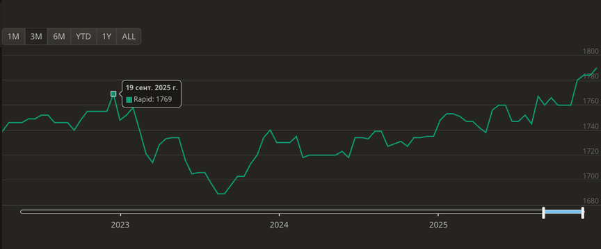
The axis below the graph is only used to select the interval to show. What you see is rating graph over the interval selected (the blue segment on the right) which is fully within year 2025.
(Yes, it's a bit confusing but you get used to it.)
The axis below the graph is only used to select the interval to show. What you see is rating graph over the interval selected (the blue segment on the right) which is fully within year 2025.
(Yes, it's a bit confusing but you get used to it.)
The current design is just unintuitive and misleading... I think there's also another thread on this where we discussed this. :-)
The current design is just unintuitive and misleading... I think there's also another thread on this where we discussed this. :-)
Okay, now I figured. Thank you for clarifying.
Okay, now I figured. Thank you for clarifying.


