
The World Championship Match in 5 Graphs
Looking back at an exciting matchNow that the world championship match is over, I thought that it’s a good idea to take a final look back at the match as a whole. In previous posts, I looked at the individual games in some detail and now I’ll try to give an overview of the match as a whole.
Quality of Play
The most obvious thing to look at with engines is the quality of play. So I first looked at the move accuracies for both players.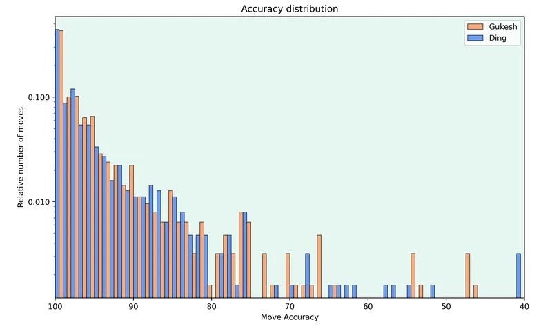
Accuracy distribution for both players
The graph shows the relative number of moves made with each accuracy. Note that the y-axis is logarithmic.
Both players mostly played very accurately and there is hardly any difference in the number of moves they played with an accuracy higher than 80. But differences appear in the less accurate moves. Ding played more inaccuracies with an accuracy score between 55 and 65. Gukesh made a couple of more mistakes but this was offset by Ding’s 2 blunders in the match.
In addition to looking at how accurately the players played their moves, it’s also interesting to see how often they ended up in good or bad positions.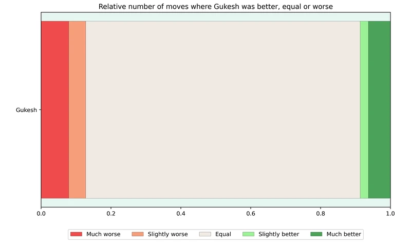
The graph shows the relative number of moves that Gukesh was much better (evaluation greater than +1), slightly better (evaluation between +1 and +0.5), equal (evaluation between +0.5 and -0.5), slightly worse (evaluation between -0.5 and -1) and much worse (evaluation below -1). Note that the graph for Ding would be the inverse of the graph above.
It’s surprising to see that Gukesh was more often worse than better, even though he won the match. This is because Ding lost games 11 and 14 due to blunders after which he resigned quickly, whereas Gukesh played on longer in the games he lost.
Finally, it’s also always interesting to see how well the players used their chances. To do this, I looked at the number of games where the players were much better (evaluation greater than +1) and the number of games the players actually won.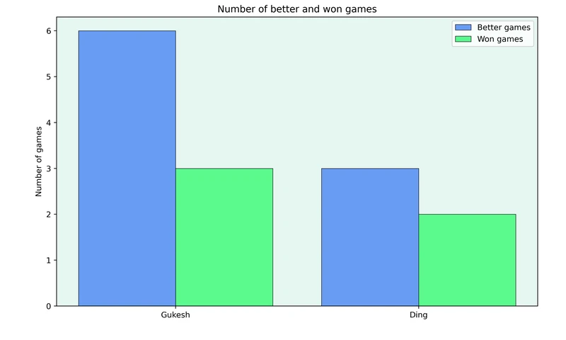
Gukesh was much better in 6 games but “only” managed to win 3 of these games. On the other hand, Ding has only failed to convert one game where he was much better.
Sharpness
One thing I always like to look at is the sharpness of the games. To do this for the match, I calculated the average sharpness change on each move for both players.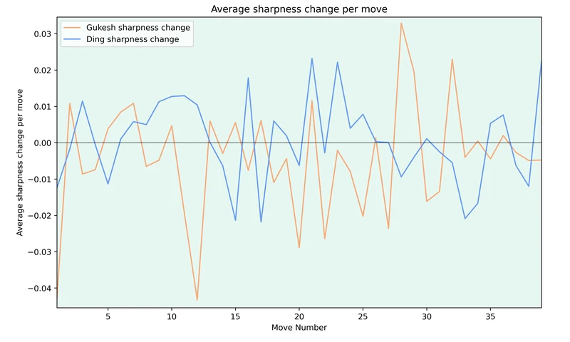
To be honest, I don’t know how much one can take from a graph like this. But it shows that Gukesh tried to keep the games going between moves 25 and 35 while he played more calmly in the early middle game.
Clock Times
Another story about the match was Ding’s time usage early on in the games. When plotting the average time remaining for each player, one gets the following graph.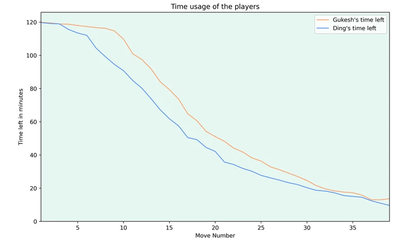
While Ding’s time usage looks much less extreme (this is due to some games that were played quickly from both players), it’s clear that Ding fell behind on the clock early on in the games and while he started to narrow the gap around move 15, he never quite caught back up with Gukesh’s time.
Conclusion
I would like to find a good way to get an overview of a match using just engines and without looking through individual games. While I think that the graphs above are a good start, I still feel that there is much room for improvement. So let me know what you would like to see added to make the overview more complete.
If you enjoyed this post, check out my Substack.
More blog posts by jk_182

Comparing the Rise of 3 Generations of Chess Prodigies
How has the climb through the ranks changed?
A Visual Recap of Tata Steel 2025
As every year, the Tata Steel tournament in Wijk aan Zee was very exciting. Many young stars partici…
Creating an Accuracy Score based on GM Games
How can the quality of classical grandmaster games be calculated?