
Looking at Piece Heatmaps in Different Openings
When studying openings, it’s important to get a feeling where the pieces generally belong in that structure. But developing this intuition often requires going through many games which is very time consuming.I thought that one might also get some insights into an opening by looking at heatmaps of the pieces. Since they show the average position of each piece, one might see where a piece belongs in a certain opening. So I generated heatmaps from grandmaster games to look at a few different openings.
Note that the images are a bit blurry here (I don't know why), so if this bothers you, you can read the post on Substack.
Generating the heatmaps
To generate the heatmaps, I downloaded between 500 and 1000 grandmaster games for each opening I looked at and counted the number of moves a piece was standing on each square. I then divided these move numbers by the total number of moves to get the percentage of moves the piece spent on that square.
Note that I counted the squares for each piece type. So I always looked at the position of both knights at once, instead of having one heatmap for the kingside knight and one for the queenside knight.
As a first example, I looked at heatmaps in the exchange variation of the Queen's Gambit Declined. So I only looked at games that reached the following position:
Here are the heatmaps for both colors from 800+ GM games:
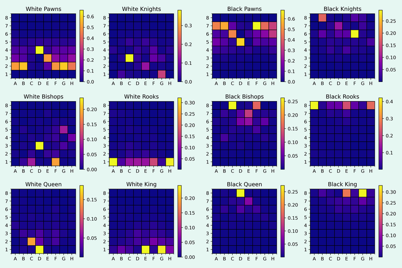
It’s really interesting to see where the pieces spent most of their time. Some pieces, like the white’s king bishop on d3, find a clear home, whereas other pieces, like black’s queenside knight, move around a lot throughout the games.
Looking at the heatmap of the white bishops, one also sees that the light squared bishop seems to be much longer on the board than its counterpart on the dark squares. This indicated that the dark squared bishop gets traded off earlier and more often than the light squared bishop.
The pawn structure in the center looks very rigid, but one can see that both sides move the pawns on the flanks to many different squares without any clear pawn push being favored.
If you enjoy my post, check out my Substack.
Minimum and maximum move cutoffs
One thing that stands out in the heatmaps above is that many pieces spend a lot of time on their starting squares. This comes from the fact that every piece spends the first couple of moves in every game on that square, so they will light up in a heatmap.
One could avoid this by only counting a piece after it has moved once. But I didn't like that approach because it doesn't show which pieces stay on their starting squares longer. Instead, I only looked at the pieces after move 7 (an arbitrary cutoff) and generated the heatmaps again.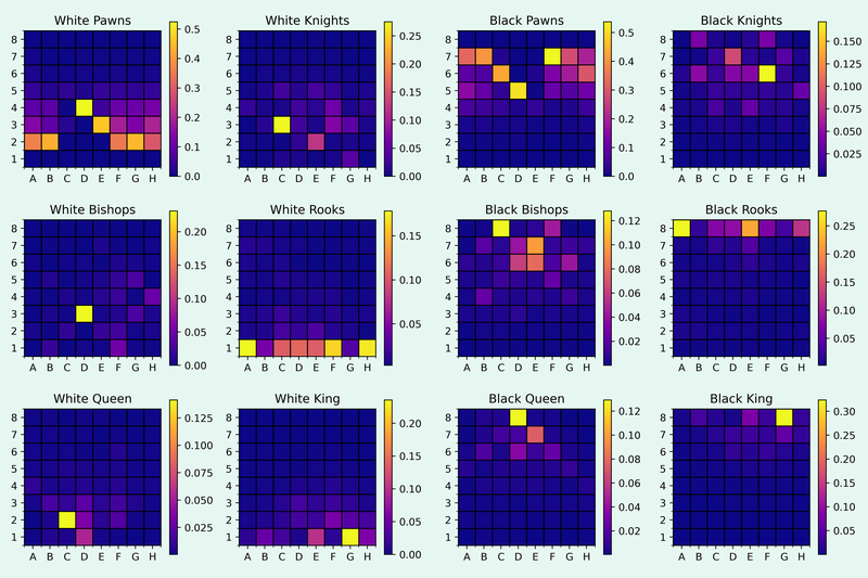
The biggest change is probably in the king positions, since e1 and e8 aren’t very common squares for the kings anymore. Now it’s also quite clear that the white queen doesn’t stay on d1 that long, and most of the time moves to c2.
Another thing to note is that as the game progresses, the structure and the placement of the pieces changes a lot, depending on the specific game. So when looking at openings, it might make sense to also introduce an upper limit for the move number one looks at.
Below are again the heatmaps for the same games, but now only showing the average piece positions between moves 7 and 30.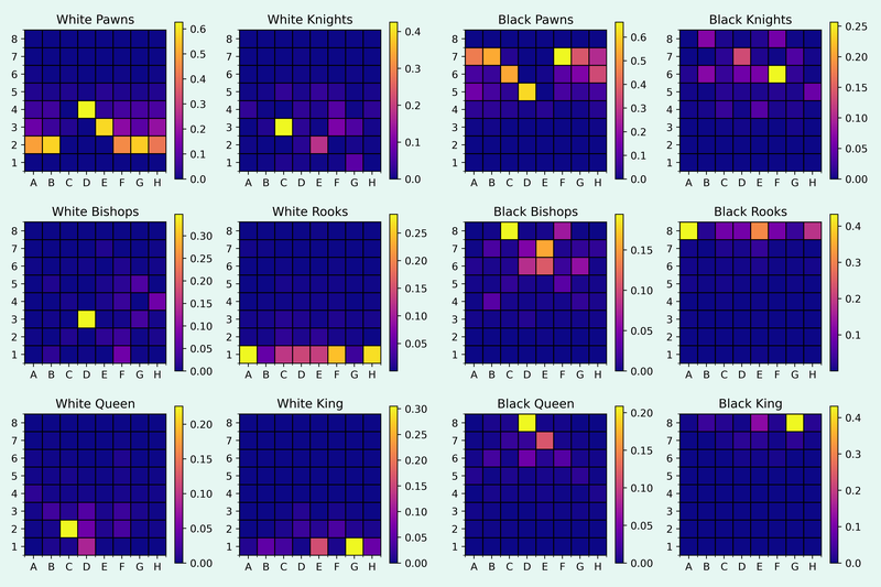
The visual differences are very subtle, but when one looks at the colorbar besides the heatmaps, it’s clear that the heatmaps are much more concentrated. For example, the black king spent around 30% of the moves on g8 when looking at all moves after move 7 but when introducing the cutoff at move 30, it spends around 40% of the time on g8.
Also white’s kingside pawn pushes become less pronounced, which might indicate that many of them only happen in the endgame.
Other heatmaps
I also generated heatmaps for some more openings. I'll only show the heatmaps of the pieces between moves 7 and 30.
Here are the heatmaps for the Morphy variation of the Ruy Lopez: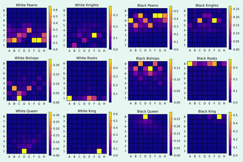
One thing that stands out here is that the pawn structure is more fluid, so most pawns don’t have such clear positions on the heatmaps. The difference in the heatmap of the white rooks compared to the QGD above is also quite interesting, since the queenside rook stays on a1 most of the time and the kingside rook mostly moves to e1.
And here are the heatmaps for the King's Indian Defence: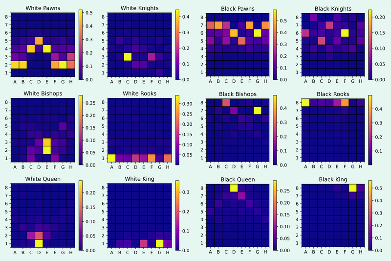
The thing that stood out to me about these images is the heatmap of the black knights. The kingside knight settles on f6, while the queenside knight seems to be on many different squares, depending on the setup black chooses.
Conclusion
I find looking at the heatmaps interesting, but I’m unsure how instructive it is. The big issue for me is that there are often different plans in a position and each plan requires a different piece setup. And on the heatmaps, one can’t see which piece placements go together.
For example, in the Carlsbad developing the king’s knight to e2 instead of f3 often leads to the plan of playing f3 and e4. But this can’t really be seen in the heatmaps. It might make sense to only look at very specific variations, but then one might not have as many games available.
I’m very interested in what you think about these heatmaps and if you find them instructive. There might also be other uses I haven’t thought about.
If you want to read more, I looked at piece placement in specific positions, when I tried to find the ideal square for pieces with Stockfish.
You may also like
 CM HGabor
How titled players lie to you
This post is a word of warning for the average club player. As the chess world is becoming increasin… jk_182
Looking at the Quality of Rapid and Blitz Games
How does the quality of play from GMs change in different time controls? D2D4C2C4
Why Opening Statistics Are Wrong
Opening statistics, such as those in the opening explorer have a methodological flaw. They tend to s… CM HGabor
Effective training methods - doing tactics
My previous post was about chess training in general. We will dive into the details now. So, what yo… jk_182
Is Carlsen better after losing a game?
Looking at Carlsen's score based on the previous result jk_182